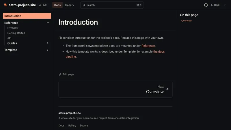
docs
The docs
Starlight with this site's theme, header and footer. Search, a generated sidebar, edit links, a link check on every build.
The gallery is a content collection: one file per item in src/content/gallery/. It feeds the /gallery/ page
(with kind and tag filters) and the strip on the landing page. Items can link anywhere: a mirrored demo, a docs
page, another site.
title: Playgrounddescription: Try the parser in the browser.href: /apps/playground/ # a site path or a full URLkind: demo # free-form; default "example"tags: [interactive, canvas]order: 1 # ascending; ties sort by title; default 100poster: ./playground.png # next to this file, optimised at build timeposterAlt: '' # empty (default) = decorative, the title names itThe same fields work as JSON, or as Markdown frontmatter (.md). Other options:
posterUrl: /apps/playground/poster.png uses an image as it is (from public/, a mirror, or a full URL)
instead of poster.pixelated: true scales the poster with crisp pixels (pixel art, sprites).external: true marks a link that leaves the site; links with a scheme:// are marked anyway.draft: true hides the item without deleting it.Every field and default: Gallery item. Items outside
src/content/gallery/: projectSiteCollections({ galleryBase: './gallery' }).
Every published item, sorted by order then title. Kind buttons appear when there is more than one kind, tag
buttons when any item has tags. The filters are hidden until their script runs, so without JavaScript every item
shows; the chosen filter is kept in the URL (/gallery/?kind=demo&tag=canvas), so it can be shared.
Title and description of the page:
gallery: { title: 'Showcase', description: 'Things built with My Lib.' }, // defaults: "Gallery", "Demos, examples and tools, running live."gallery: false removes the page, the default “Gallery” nav link and the landing strip. A
src/pages/gallery.astro of your own replaces the page. To restyle the body only, override Gallery or one
card with GalleryCard (Overriding components).
This site’s own gallery items, through the same components the page uses:
docs
Starlight with this site's theme, header and footer. Search, a generated sidebar, edit links, a link check on every build.
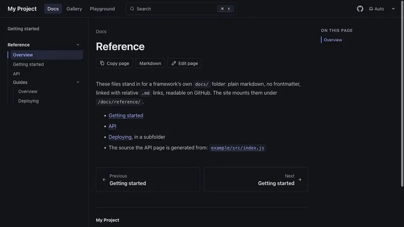
docs
The starter's example docs/ folder, plain markdown with no frontmatter, mounted under /docs/reference/ with its .md links rewritten.
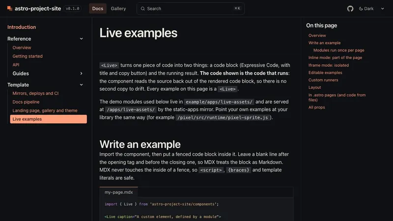
demo
The <Live> component on a docs page, inline and in iframes, editable, with a custom runner.
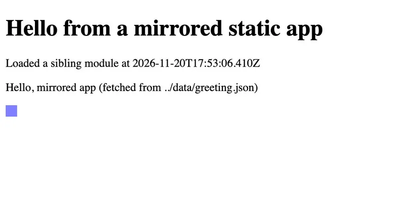
demo
A static HTML page with its own scripts, served byte for byte from the repository at /apps/hello/.
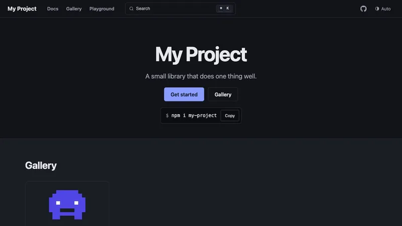
starter
What project-site init creates, built and deployed as it is, with no changes. Source in starters/default.
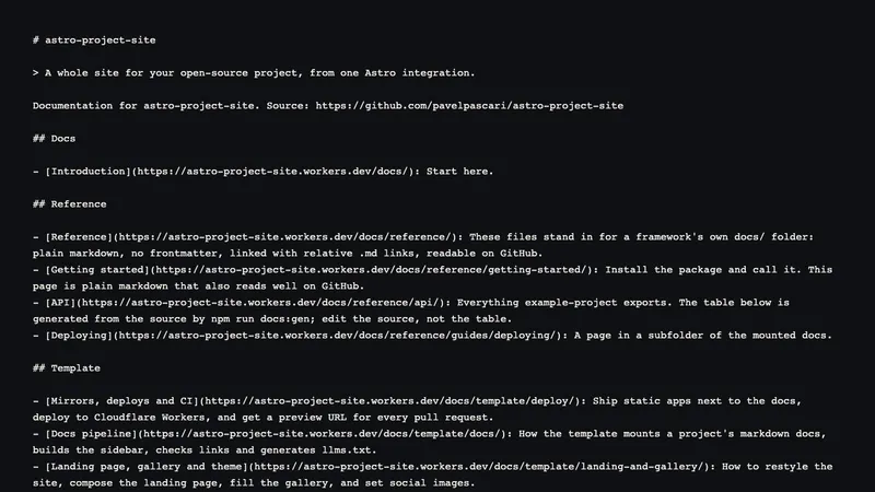
---import { GalleryGrid, GalleryFilters, galleryItems, distinct } from 'astro-project-site/components';const items = await galleryItems(); // published, sortedconst kinds = distinct(items, (i) => [i.data.kind]);const tags = distinct(items, (i) => i.data.tags).sort();---<GalleryFilters kinds={kinds} tags={tags} target="grid" total={items.length} /><GalleryGrid items={items} id="grid" headingLevel={4} minWidth="12rem" />Each card is a plain <article> with a stretched link on the title; GalleryGrid uses your GalleryCard
override when there is one.
The landing page shows the first three items (landing.gallery.limit, 0 hides the strip) with a link to
/gallery/. In your own page, GalleryStrip can also pick kinds:
Running in your browser.
demo
The <Live> component on a docs page, inline and in iframes, editable, with a custom runner.
demo
A static HTML page with its own scripts, served byte for byte from the repository at /apps/hello/.
<GalleryStrip title="Demos" intro="Running in your browser." limit={2} kinds={['demo', 'example']} />